Futura
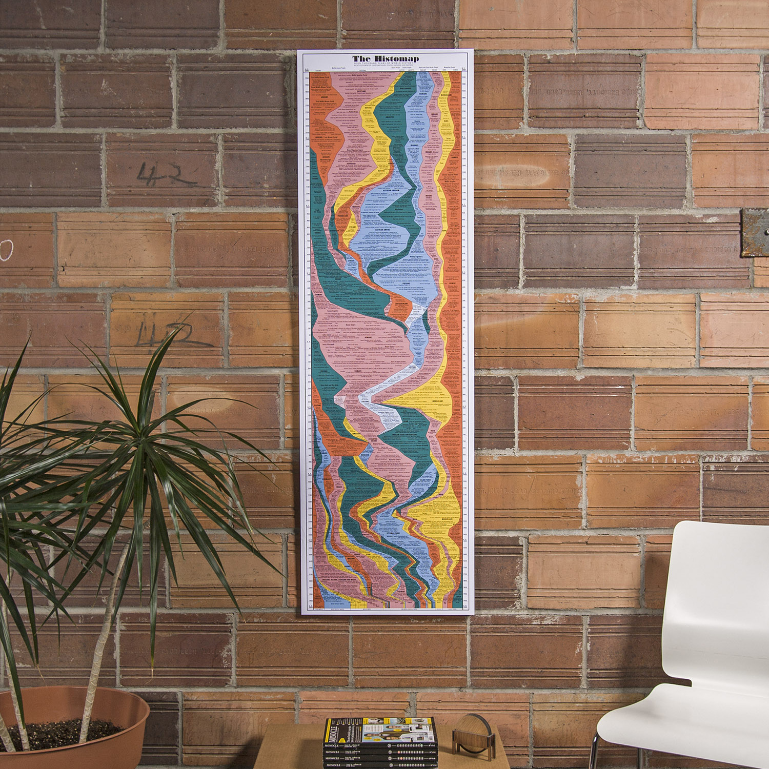
Futura is a typeface we’ve gone to for a couple different things ranging from projects pieces to the updated Histomap.
This was the first typeface to make the trip to the moon and was designed by German typographer Paul Renner in 1927. With its tie to space and historic uses, there shouldn’t be any surprise as to why we love using Futura in our work.
It’s a versatile typeface that also pulls inspiration from the Bauhaus design style. It looks great when used digitally but, like the plaque that went to the moon and the pieces we engraved below, it also looks comes out well etched and engraved into a variety of material.
Designer:
Edwin W. Shaar (Extra Bold, Extra Bold Italic)
Tommy Thompson (Extra Bold Italic)


